UX Strategy & Information Architecture
OPPI Data Hub Redesign
Redesigned a complex government data hub to improve accessibility, usability, and navigation clarity for diverse public audiences.
Responsibilities
Stakeholder Feedback
Facilitated feedback sessions with stakeholders to understand platform goals, content pain points, and public-facing information needs.
Site Structure Testing
Tested the site structure to evaluate whether users could locate datasets, reports, and submission tools without unnecessary backtracking.
User Flow Mapping
Developed user flow maps for primary task scenarios, including finding datasets, reviewing reports, and completing submission workflows.
Requirements Documentation
Documented requirements and acceptance criteria to support implementation, stakeholder alignment, and future content governance.
Brand Consistency
Followed brand and style guidelines to keep the redesigned experience consistent, professional, and aligned with public-sector expectations.
Accessibility Support
Reviewed navigation, labeling, content hierarchy, and interaction patterns through an accessibility-focused design lens.
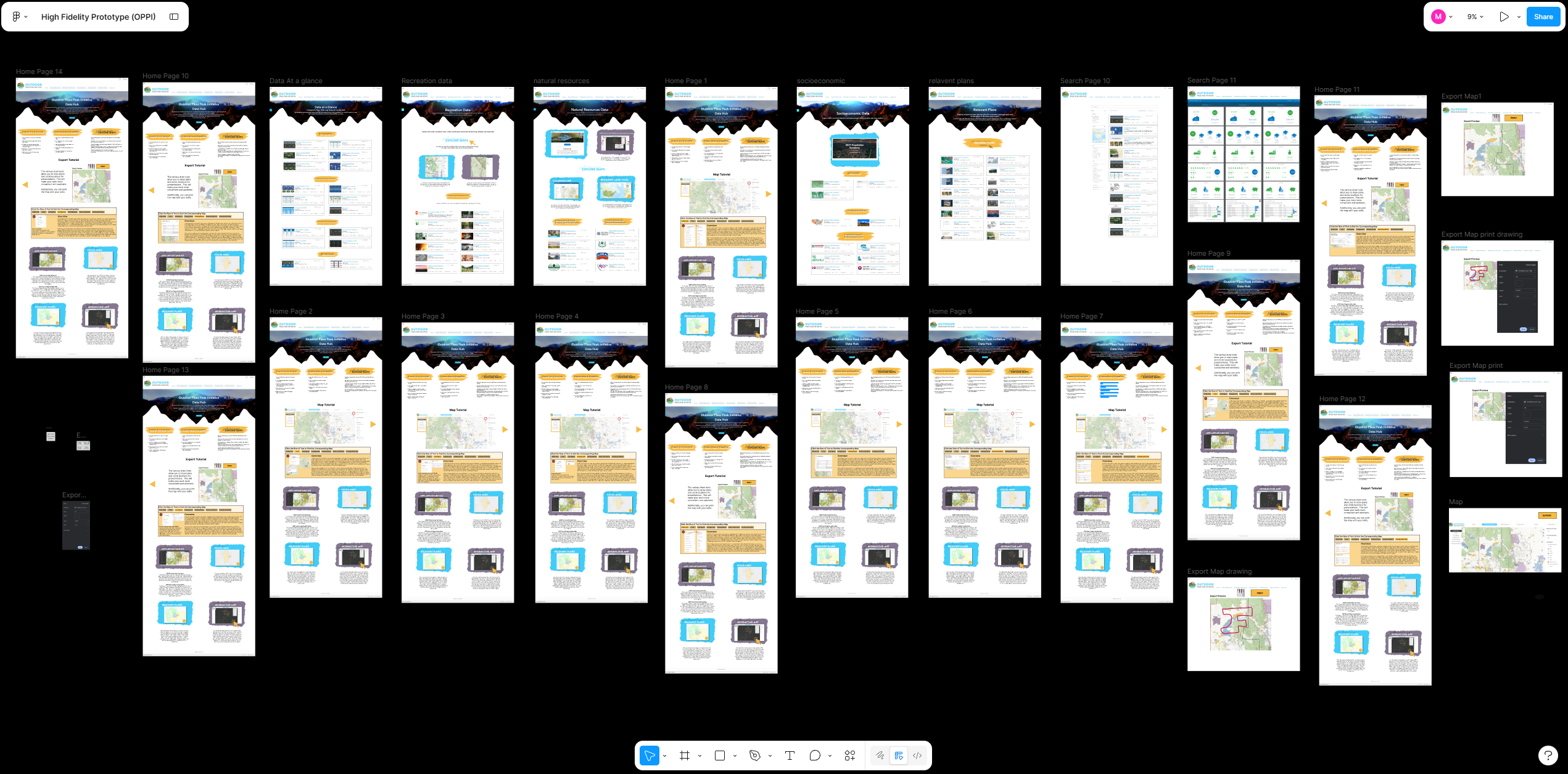
Overview
Creating a clearer entry point for public-sector data
The OPPI Data Hub serves as a central resource for public-sector data across multiple agencies. The existing site had grown organically over several years, creating navigation friction and structure inconsistencies.
This redesign focused on improving navigation and information architecture to create a clear, accessible, and intuitive experience.
Service Value
Making complex information easier to access, maintain, and scale
The redesigned OPPI Data Hub connects public-sector datasets, reports, navigation pathways, and submission workflows into one clearer digital experience. The value of the redesign comes from making complex information easier to access, easier to maintain, and easier to scale over time.
Improved navigation clarity for public users searching across complex data categories.
Created reusable structure for future datasets, reports, and content updates.
Supported better task completion through clearer labels, page hierarchy, and guided pathways.
Problem & Goals
Reducing friction in a disorganized content structure
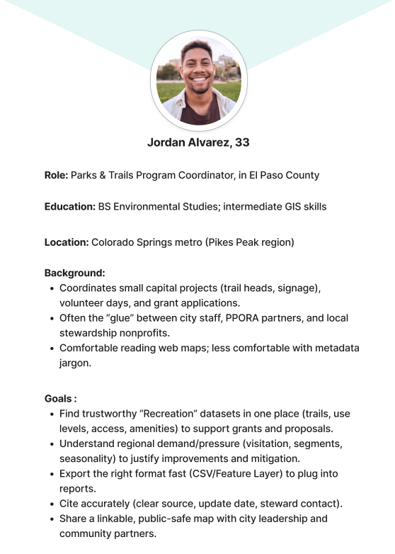
The primary challenge was a disorganized content structure that made it difficult for users to locate relevant datasets and reports.
Business goals included improving search behavior, supporting faster task completion, and creating a scalable architecture for future growth.
Navigation Clarity
Users needed clearer categories and menu labels to understand where datasets, reports, and submission tools were located.
Search Confidence
Users needed better filtering cues and page labels to feel confident that they were viewing the right results.
User Scenario
Arrive at the Data Hub
The user enters the site looking for public-sector data, reports, or resources related to a specific topic or location.
Browse by Category
The user scans organized categories and chooses a path that matches their task instead of sorting through unrelated links.
Filter Results
The user applies filters to narrow results and quickly identify datasets, dashboards, or reports that match their needs.
Review Details
The user opens a resource page with clear labels, supporting context, and structured information before downloading or sharing it.
Complete a Submission
The user follows a guided submission workflow with clearer steps, helping reduce confusion and incomplete form entries.
My Role
Connecting stakeholder goals with user-centered structure
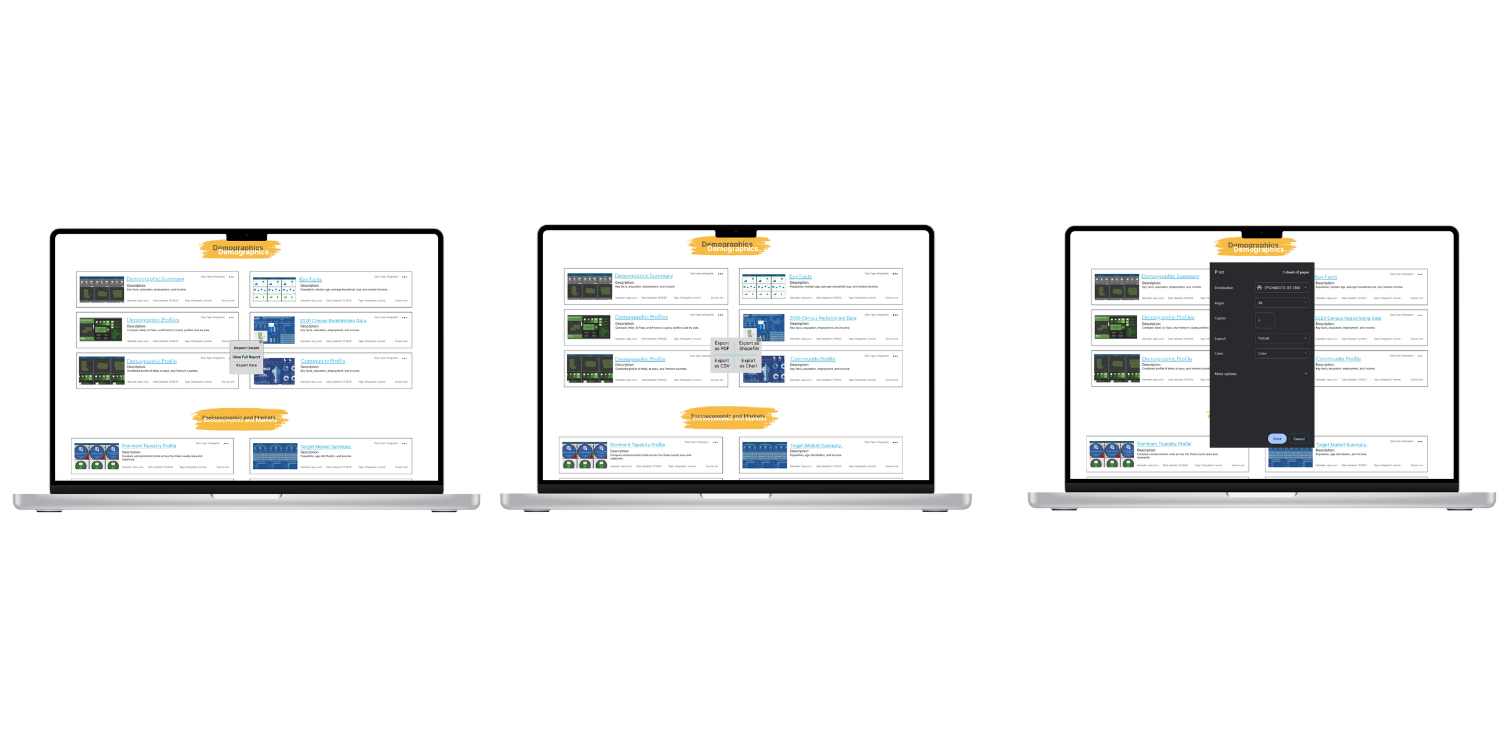
As a Technical Communication and Information Design professional, I led stakeholder interviews and collaborated closely with another information design professional to align workflows with project goals and user needs.
Jordan Lee
Community researcher
Jordan uses public datasets to understand local trends and needs a clear way to locate reliable reports without sorting through disorganized pages.
Goals
- Find relevant datasets quickly
- Understand report context
- Download or share resources confidently
Elena Martinez
Public-sector program coordinator
Elena needs a scalable content structure that helps staff maintain pages, publish updates, and guide users through submission workflows.
Goals
- Maintain consistent content
- Reduce repeated user questions
- Support accessible public information
Discovery & Constraints
Understanding content problems before redesigning the interface
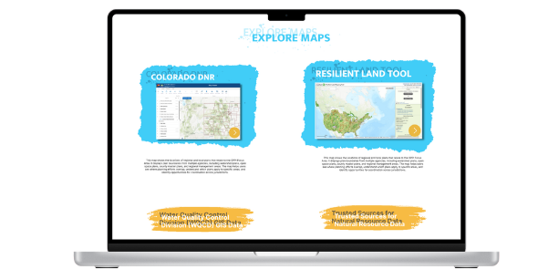
Discovery included stakeholder interviews, moderated usability sessions, and comparative analysis of related data portals. Constraints included a fixed platform, a tight delivery window, and preserving existing URLs for continuity.
Scannable Content
Long pages needed stronger headings, shorter content blocks, and clearer hierarchy to support faster decision-making.
Accessibility Needs
The redesign needed readable structure, keyboard-friendly pathways, accessible contrast, and consistent interactive patterns.
Scalable Governance
Stakeholders needed reusable templates and standards that would make the site easier to maintain as content expanded.
Key Features
Simplified Navigation for Public Data Access
The redesigned navigation structure helps users move through datasets, reports, and resources with fewer decisions. Clear labels, grouped categories, and predictable page paths make the data hub easier to browse for both first-time visitors and returning users.
Improved Search and Filtering Behavior
Search and filtering patterns were organized around user intent, allowing users to narrow results by topic, category, location, or report type. This reduced friction for users who needed to quickly locate specific public-sector information.
Accessible Content Structure
The redesigned content structure focused on readable headings, consistent labeling, clearer hierarchy, and accessible interaction patterns. This helped make complex government information easier to scan, understand, and navigate across user groups.
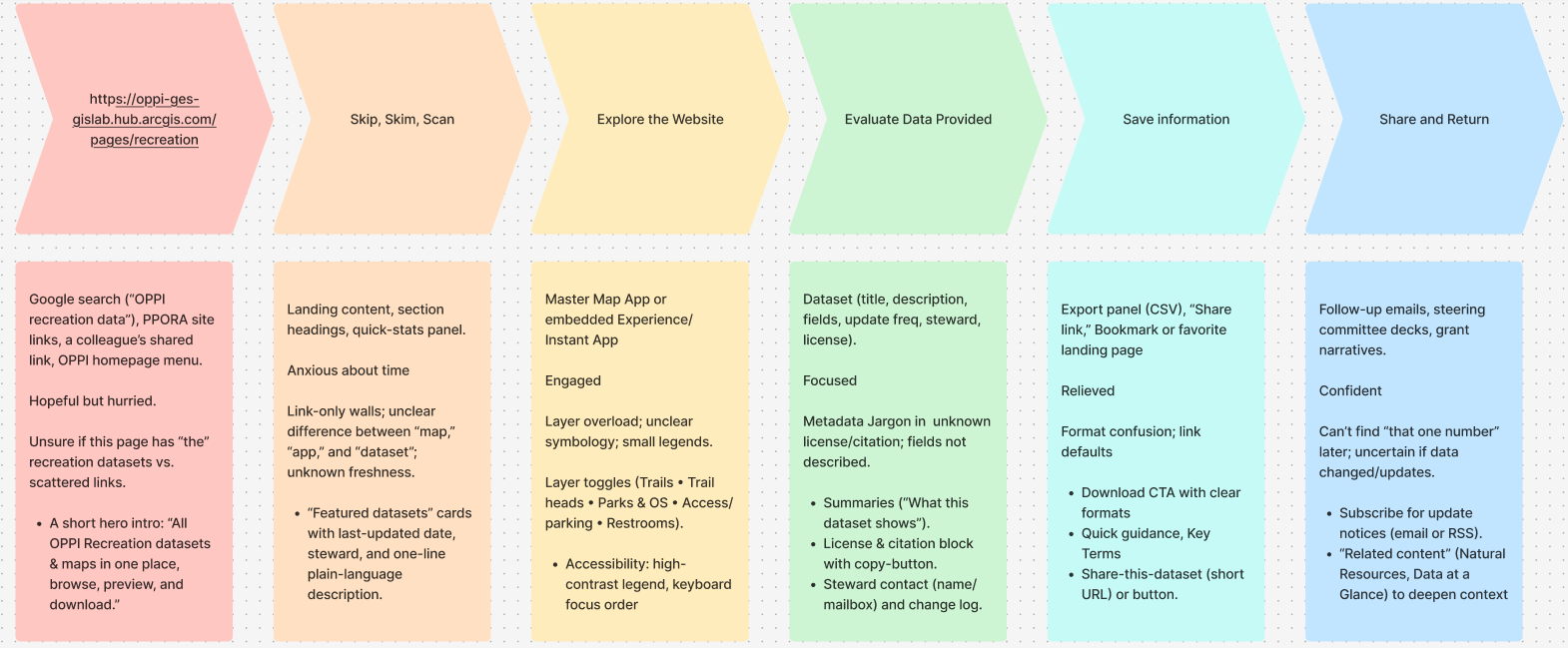
Information Architecture & User Flows
Designing clearer pathways for major user tasks
The revised architecture introduced a clearer taxonomy for datasets and an improved hierarchy for filtering and wayfinding.
Three key user flows were designed: finding and downloading datasets, exploring trails and reports, and completing a submission workflow from entry point to completion.
Task Completion
Primary workflows needed fewer dead ends and clearer next steps so users could complete tasks without backtracking.
Prototype Walkthrough
Interactive prototype review
The prototype walkthrough demonstrates the redesigned navigation, clearer page hierarchy, improved filtering behavior, and task pathways for users moving through the OPPI Data Hub.

Outcomes & Next Steps
Approved redesign architecture with future rollout planning
The redesign architecture was approved for implementation with full documentation and a broader content strategy rollout planned for future phases.
Supporting process work included Figma wireframes, Confluence requirements, and analytics-informed iteration cycles that improved filtering behavior, content labeling, and breadcrumb orientation.
Refine the dataset taxonomy and continue validating labels with users.
Expand content governance documentation for future updates.
Track analytics for search behavior, filtering success, and task completion.
Next Steps
Next steps include expanding the content governance documentation, refining the dataset taxonomy, and preparing implementation guidance for future site updates.
Future iterations would include additional usability testing with public users, deeper accessibility review, and analytics tracking to evaluate search behavior, filtering success, and task completion.
Learnings
This project strengthened my ability to translate complex information systems into clearer navigation, structured content, and user-centered digital workflows.
I also learned how important stakeholder alignment, content standards, and scalable information architecture are when redesigning a public-facing data platform.